Categories
Design Investigations

Plasmatic Mirror

An Architectural Scale Interactive Display

by Yanni Loukissas, Ploypilin Pruekcharoen, Emily Weigel, Miles Appleton

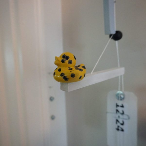
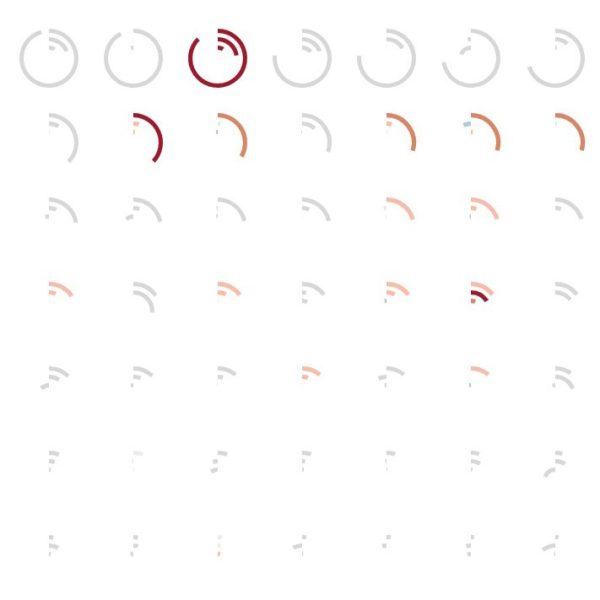
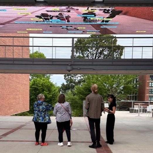
For humans, all data are felt experiences. Unlike our computers, which can only be data-driven, we must hold data in tandem with our feelings about the subjects they represent. In this project, developed in javaScript (p5.JS) we explore designs for an affective data setting: an arena in which participants can reflect on their feeling-based judgements about a subject in relation to relevant evidence. Displayed on a 30-foot wide, architectural scale media canvas at the center of an urban university campus, the project invites passersby to interact with and orientate themselves in relation to data on new stories about the environmental and human health effects of microplastics. Our project, which includes qualitative reflections on its production and reception, offers lessons about how public data visualizations can resonate on an emotional register. At the heart of the project is a human question, what can data do: not just for us instrumentally, but to us emotionally?


Categories
Design Investigations

Chromatic Lens

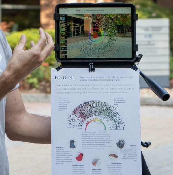
Chromatic Lens: An augmented-reality inquiry into the color data of eBird

by Yanni Loukissas, Emily Weigel, Michael Zhou, and Shruti Vedula

Chromatic Lens (formerly Eco Glass) is an augmented-reality data visualization developed for the Apple iPad, which uses color data extracted from photos in eBird: a collective database of over 100 million bird sightings (images). The application, written in p5.js (a JavaScript library) works like an interactive applique, layered over the live video feed of the iPad’s built-in camera.

This is work that I have undertaken with a small, interdisciplinary team of faculty and students (Shruti Vedula, Emily Weigel, and Michael Zhou) drawn together by a shared interest in exploring the educational potential of creating local, augmented-reality data visualization projects, as an alternative to the use of generic platforms, such as “Google Glass.” We have found that creating and using local lenses to explore the environment can help students think critically about more-than-human relationships.

For Chromatic Lens we leveraged abundant photographic documentation on local birds—rock pigeons, brown thrashers, northern cardinals, red-tailed hawks, among others—to help students understand the more-than-human significance of color on our campus. For example, Chromatic Lens helped students see how environmental changes due to both global climate shifts and local development projects can make life difficult for birds that rely on color to hide from predators or to be noticed by potential mates. The paper draws on a situated analysis conducted for two educational workshops. Our findings reveal the strengths and limitations of Chromatic Lens, as well as the broader significance of creating augmented-reality data projects in the context of STS education about more-than-human relationships.

Categories
Design Investigations

Turbidity Wall

If we want to understand the affective power of data in shaping our experiences of place, we need new forms of inquiry that reveal what data can do: not just for us, but to us. In this paper, we explore how engaging with data changes the way we feel about environmental concerns that we live with through an approach we call local data memoir. This approach brings together autobiographical making and writing with theorization through a phenomenological lens, specifically using the concept of orientation. We find that attending to our own orientation can be a useful means of tracking how our lived experiences are shaped by practices with data. Our contributions are two-fold: first, we demonstrate how the phenomenological concept of orientation can be used to interpret encounters with data; second, we introduce local data memoirs as a form of affective inquiry with data.

Sylvia Janicki and Yanni Alexander Loukissas. 2025. Making Local Data Memoirs: Changing Orientations in Relation to Environmental Concerns. In Proceedings of the 2025 ACM Designing Interactive Systems Conference (DIS ’25). Association for Computing Machinery, New York, NY, USA, 2047–2061. https://doi.org/10.1145/3715336.3735760

Full Paper available here

Categories
Design Investigations

Civic Data Guides

Over the past decade public institutions have put considerable resources towards improving the quality and availability of civic data, such as budget and expenditure information, building permits, air quality readings, police incidents, and property ownership records. The agencies behind these efforts claim that data sets alone are sufficient to create transparency, increase civic engagement, foster innovation, and ultimately make our communities more sustainable. However, making civic data accessible does not necessarily make them valuable or actionable. To take effective and ethical action, we need contextual information about the processes involved in creating, managing, and interpreting civic data. In this modular, multi-day tool, you will create an accessible, practical guide to an existing civic data set. Working through the modules below can help you, and subsequently others, engage with civic data in productive ways.

Sponsored by Georgia Tech Serve-Learn-Sustain and created in collaboration with Catherine D’Ignazio and Bob Gradeck

Download here

Categories
Design Investigations

Map Room / Map Spot

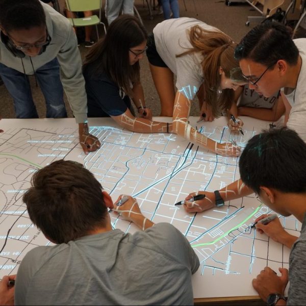
The overarching goal of the Map Room / Map Spot Project is to develop local spaces for grassroots map-making, where people can creatively and collaboratively explore data. Conventional digital maps can help people see rapid, large-scale social and environmental changes, even as they unfold. But often these maps are based on abstract data alone and are, therefore, disconnected from the lived experiences of their audiences. The Map Room / Map Spot Project aims to empower people to understand, but also challenge and even redefine the stories that maps and data tell about their lives, and about the places they live.

This project is an expansion of the St.Louis Map Room, originally created in 2017 by the Office of Creative Research in partnership with COCA. In the summer of 2018, funding from DILAC and NSF enabled us to build a new, research-oriented Map Room on the Georgia Tech campus. Our research questions include the following: what counts as civic data? what does an effective conversation around civic data look like? how can civic data become the source materials for acts of creative and collaborative expression, and to what end?

Last year, in 2019, renewed funding enabled us to create a more versatile map-making system, which we call “Map Spot.” This new, low-cost prototype enables temporary, pop-up map-making spaces virtually anywhere. We have already tested the system at high schools, museums, conferences, and design offices across the United States.

Most recently, we have begun using Map Room technology for resilience planning as part of the Smart Sea Level Sensor team, “a collaboration among Chatham Emergency Management Agency officials, City of Savannah officials, and Georgia Tech researchers who are working together to install a network of internet-enabled sea level sensors across Chatham County.”

Apparatus:

The Map Room is best understood as a hybrid map-making tool, that is both digital and hands-on. Accessibility is the priority and people, not machines, are in control. Participants use our custom-designed software, built on the infrastructure of OpenStreetMaps, to identify a geographic region they want to map. This must be an area that they already know well. They can then select from a variety of preloaded data overlays to work with, for example from government, academic, or commercial sources. The resulting image is sent to an overhead projector, which illuminates a large-format sheet of paper and guides participants as they use pens, markers, paint, collage materials—any visual media of their choice—to create physical maps that juxtapose existing data with representations of their own lived experiences.

Example Map:

Current Team:
Nicholas Boshart, Sukhmai Kapur, Yanni Loukissas, Jude Ntabathia, Jer Thorp

Past Team Members:
Muniba Khan, Lucas Phillips, Christopher Polack, Annabel Rothschild, Jihan Sherman, Raya Ward

Press:
Aviles, Mary. “Indelible Impressions: Why You Won’t Forget the Map Room Project,” Nightingale, 2020.

Recent Publications:

2018 Video:

Categories
Design Investigations

A BeltLine for All?

This map visualizes demographic indicators of gentrification in neighborhoods (defined by census tracts) along the current and proposed path of the Atlanta Beltline. Created with Christopher Polack and Peter Polack for a report by the Housing Justice League and Research | Action. See the full interactive visualization here: http://loukissas.lmc.gatech.edu/beltline

Categories
Design Investigations

Data Walks


Data Walk Workshop

Dipartimento di Design, Politecnico di Milano | May 8-12, 2017
Special Thanks to Paolo Ciuccarelli (Program Director) and Tommaso Eli (Teaching Assistant)  

Overview

How can design put data in its place?

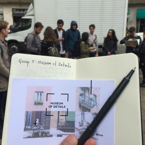
During a week in early May, I led a workshop at the Politecnico di Milano to investigate this question. A group of twenty-nine Communication Design students participated. They worked in small teams to explore the design opportunities and challenges posed by situating data in an unfamiliar setting: a walk.

Today, in 2017, we often think of data and place as being independent of one another (Loukissas 2016). Data are infinitely small, technical, and abstract while places are spatial, social and experiential. Nevertheless, data and place are linked. Indeed, “data walk” is not an oxymoron. For data can only be made and made sense of in places of production and display.

Data don’t live on the head of a pin, or a hard drive.  Easy enough to say. Over the course of five days, I asked students to show how data and place are connected by designing walks that would take us through both data sets and data settings. Walking became the algorithm that allowed us to connect data and place in a series of surprisingly evocative encounters.

Student projects explored how practices of both collecting and displaying data might be critically reimagined through the structure of their walks. Walks gave rise to creative data collections: unconscious head motions, street stickers, discarded cigarette butts, minute changes in the skin. Walks also placed those data within and around the Bovisa campus of the Politecnico as: a prosthetic for walking, a soundscape, an ironic art installation, and a self-monitoring app. This range of rigorous and whimsical experiments helped us all reconsider the relationship between data and place.

The “Data Walks” workshop would not have been possible without the invitation and support of Paolo Ciuccarelli, professor and director of Communication Design at the Politecnico di Milano and Tommaso Eli, my teaching assistant and guide to Bovisa for the week. Additional thanks to all the members of Density Design Lab, who provided inspiration, moral support, and feedback.

The workshop was structured by a pair of exercises. Both explored the relationship between data and place, but in different ways:

Exercise 1. Walking for data collection

In the first exercise, students explored where data come from and how they are shaped by specific origins. This was not an abstract exercise. They learned hands-on how to make their own data sets. First, they identified a public route along which to collect data. Then, they selected a neglected or invisible subject encountered along that route as the focus of their data collection. I offered a selection of unorthodox procedures to help students develop reflexive collecting practices, such as “don’t categorize,” “use irregular measures,” “note absences,” “rely on your judgment,” and “record your own presence.” Students created and stored data using Flickr (a web app which captures images + metadata tags). Each data set captured (in its own way) what the original route looked like from the perspective of the selected subject. In the process, students learned just how human data collection can be.

Exercise 2. Walking for data display

In the second exercise, students considered the context in which new audiences might encounter their original data set. In this follow up assignment, students learned how data are affected by local settings for display. Still working in groups, they created short (~5 minute) data walks using the sets collected in exercise 1. Their data walks were both physical and informational traversals. They simultaneously took us through spaces and through a data sets, calling attention to the relationship between the data and its surrounding context.  Each group choose a procedure to help shape their walk: “narrate,” “materialize,” “participate,” “layer,” or “zoom.” The results were evaluated on three criteria. Concept: what does the data walk help us learn about the local setting? Experience: what does the data walk feel like? And technique: how is the data walk made?

Outcomes

Coming Soon
Categories
Design Investigations

Surfacecities

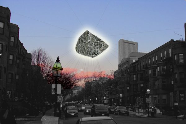
Surfacecities is a research and teaching initiative, established to study our changing images of cities in the context of a new visual culture developing around information technologies. The website http://www.surfacecities.com hosts a range of projects developed by faculty and students in the Department of Architecture at Cornell University. We are using information technologies to explore new ways of reading and handling cities for a variety of purposes, from environmental activism to extreme commuting. Our approach is to create dynamic, graphic and situated projects that extend or challenge established theories of urbanism. This work cuts across numerous fields (architecture, information science, and urban studies) in order to challenge traditional conceptions of the city that are static, depersonalized, and focused primarily on built form. In addition, it suggests new configurations of people, computers and cities that shift the discourse on human-computer interaction towards human-computer-environment interaction.

Credits:

with John Zissovici

Categories
Design Investigations

Visual Apollo

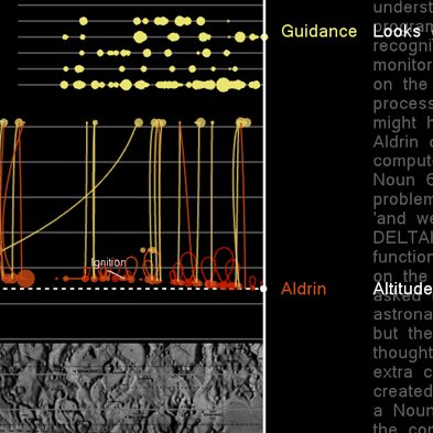
Data visualization can bring distributed social and technical relationships into view for professionals who study, design, or operate within complex computer-human systems. In traditional studies of computer-human relationships, qualitative and quantitative data are kept separate; sensor data and numerical calculations are graphed and charted, while human communications and interactions remain unseen. We believe a common format for examining both quantitative and qualitative data can reveal the multi-channel interactions in teams of humans and machines. Using the historical example of the 1969 Apollo 11 moon landing, this research presents opportunities and challenges in the visual display of social and technical data: integrating diverse sources, creating broadly accessible representations, and including time as an interactive variable. It introduces a timely and long-term endeavor, the development of a visual language and interface connecting researchers, designers, and operators in the study of distributed computer-human interactions.

Visual Apollo is available as a journal article or app for the mac here

Credits:

Created with David Mindell and the MIT Laboratory for Automation, Robotics, and Society

Categories
Design Investigations

The Life and Death of Data


In collections of scientific and cultural history that are too big to see, data act as virtual handles for rare and delicate artifacts from the past. At the Arnold Arboretum, a long-lived collection of trees, vines and shrubs managed by Harvard University, landscapes from around the world and across time are stitched together by data. However, data are worthy of study themselves. Created in varied social and technological eras, they register the organizational structures and values of their time. Through a combination of data visualization and interviews with Arboretum staff, this data documentary illuminates what data can teach us about their own social and material histories, as well as how to study institutions of collecting digitally. http://lifeanddeathofdata.org/ (Note: No longer works on Chrome)

Credits:
The interactive features of this project were designed and implemented in collaboration with Krystelle Denis. Our work was supported by The Lasky-Barajas Dean’s Innovation Fund for Digital Arts and Humanities at Harvard University and made possible by members of metaLAB and the Arnold Arboretum.