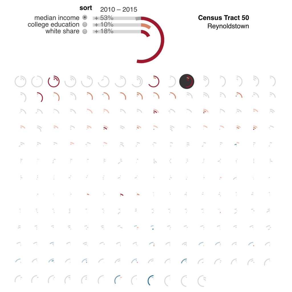
This map visualizes demographic indicators of gentrification in neighborhoods (defined by census tracts) along the current and proposed path of the Atlanta Beltline. Created with Christopher Polack and Peter Polack for a report by the Housing Justice League and Research | Action. See the full interactive visualization here: http://loukissas.lmc.gatech.edu/beltline
